09.09.2025
From Purple Beginnings to Bold Simplicity: The Evolution of the POM Logo
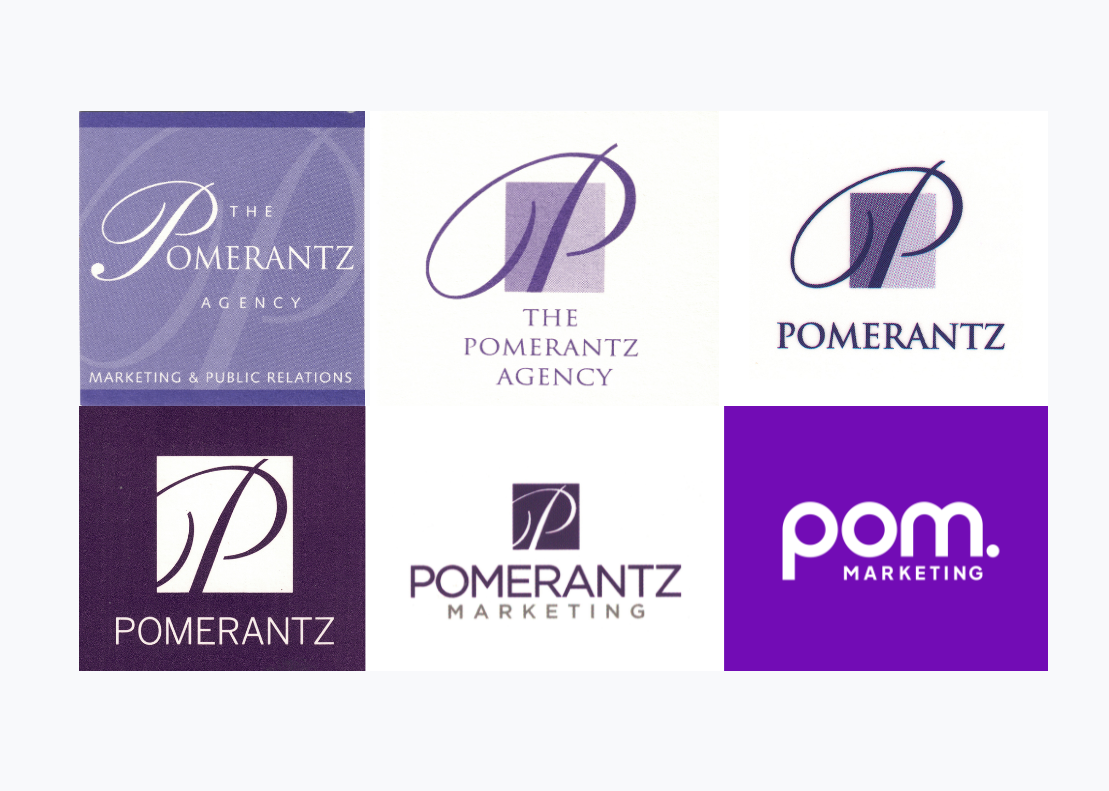
Every brand has a story — and ours has been written in purple ink. Over the years, our logo has evolved right alongside us: adapting to new markets, reflecting our energy, and mirroring the kind of work we were doing at the time. From our first “grown-up” look to today’s simplified, modern mark, our logo journey says a lot about where we’ve been — and where we’re going.
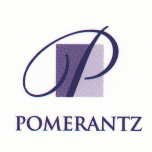
The first grown-up logo
The “P” icon came to life — classic, traditional, and polished. It was our first step into the world as a credible marketing firm.
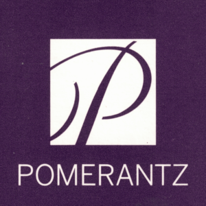
Streamlined & modernized
We kept the “P,” but gave it a sleeker, less traditional style. This was our first move toward modernizing our look without losing our roots.
Bright & tech-friendly
We brightened things up. This version reflected new energy and an appeal to the fast-moving world of tech clients.
Merlot moment
During the turbulence of the 2008 financial crisis, we shifted to a deeper “merlot” color and a no-nonsense design. It emphasized our business-minded side. But this look didn’t last long — it lacked the energy and creativity we wanted to project.

Adding "marketing" to our name
Time to clarify who we are. We added “Marketing” to the logo, chose clean, modern fonts, and simplified the design. It was direct, easy to read, and aligned with the professional yet approachable tone we had built.

The New POM Marketing
Our latest evolution — bold, fresh, and simplified. Just like our mantra for 2025: Simplify. The process wasn’t simple (rebranding never is), but the result reflects exactly who we are today: confident, modern, and ready for what’s next.
What hasn't changed
A logo is more than a design — it’s a mirror of a company’s journey. Each version of ours has told a chapter in the POM story. And while our look has changed, one thing hasn’t: our commitment to delivering serious B2B marketing firepower.
